
Product Manager — Platform / Safety
100,000+ globally
Users Impacted.
12 months (full co-op + contract)
Duration.
Introduction
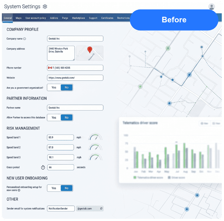
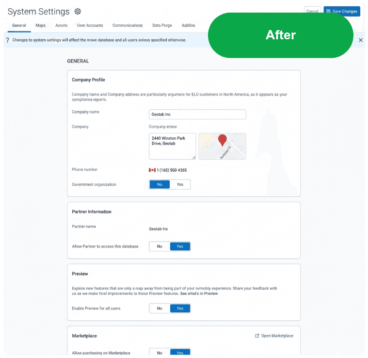
Geotab's MyGeotab platform is used by over 100,000 fleet managers, safety directors, and logistics coordinators across North America. Despite its power, the platform had accumulated years of feature growth without a corresponding investment in information architecture. Users were struggling to find key settings, dashboards were cluttered with unconfigurable charts, and the System Settings page — a critical configuration area — had become a catch-all of poorly categorized options.
Internally, support tickets showed recurring navigation confusion. Users couldn't distinguish between database-level settings and personal account preferences, leading to misconfiguration errors and high task failure rates on critical compliance workflows. The challenge: redesign the information architecture and validate it with real users before shipping.
My Objective
I was responsible for owning the discovery-to-validation pipeline for two parallel workstreams: a Card Sort study to redesign the System Settings information architecture, and a usability study to validate a new Dashboard Manage Charts feature prototype. Both required me to recruit participants, design research instruments, run moderated and unmoderated sessions, synthesize findings, and deliver actionable recommendations to engineering and design teams.
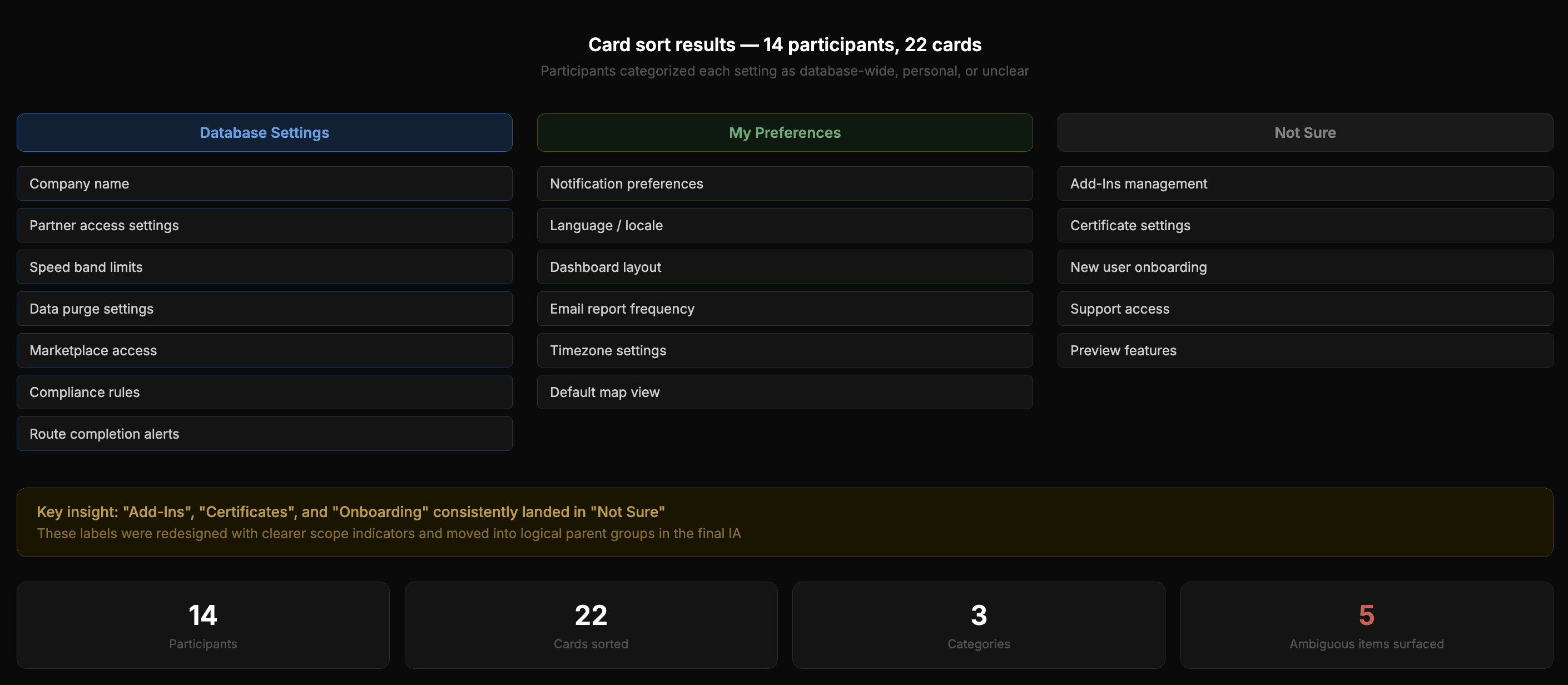
I designed and ran a card sort study with 7 internal employees and 7 external customers — 14 participants total — using UserTesting. Each participant categorized 22 cards representing settings and features into three groupings: Database Settings, My Preferences, and Not Sure. The goal was to surface how users actually thought about the distinction between platform-wide configurations and personal account settings.
A/B Test Validation
Before committing engineering resources, I ran moderated A/B tests validating a new "Manage Charts" feature against the legacy UI.
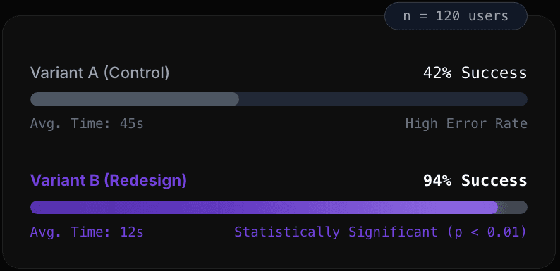
I co-designed and ran a usability study for the new Manage Charts dashboard feature using a high-fidelity Figma prototype. 8 participants completed 3 scenario-based tasks: adding a chart, removing a chart, and locating a chart they weren't sure how to find. Sessions were unmoderated with think-aloud protocol and post-task difficulty ratings.
Key Findings:
7/8 participants successfully completed Task 1 (Add Chart) with a difficulty score of 4/5 — strong discoverability
6/8 completed Task 2 (Remove Chart) — the lower rate revealed that removing was less intuitive than adding
Participants overwhelmingly validated the search bar as their preferred method for finding specific charts
The label 'Manage Chart' was flagged as misleading — participants expected 'Add' — leading to a copy change recommendation
Kabob menu per chart was validated as a needed feature, confirming the design direction before build
THE OUTCOME
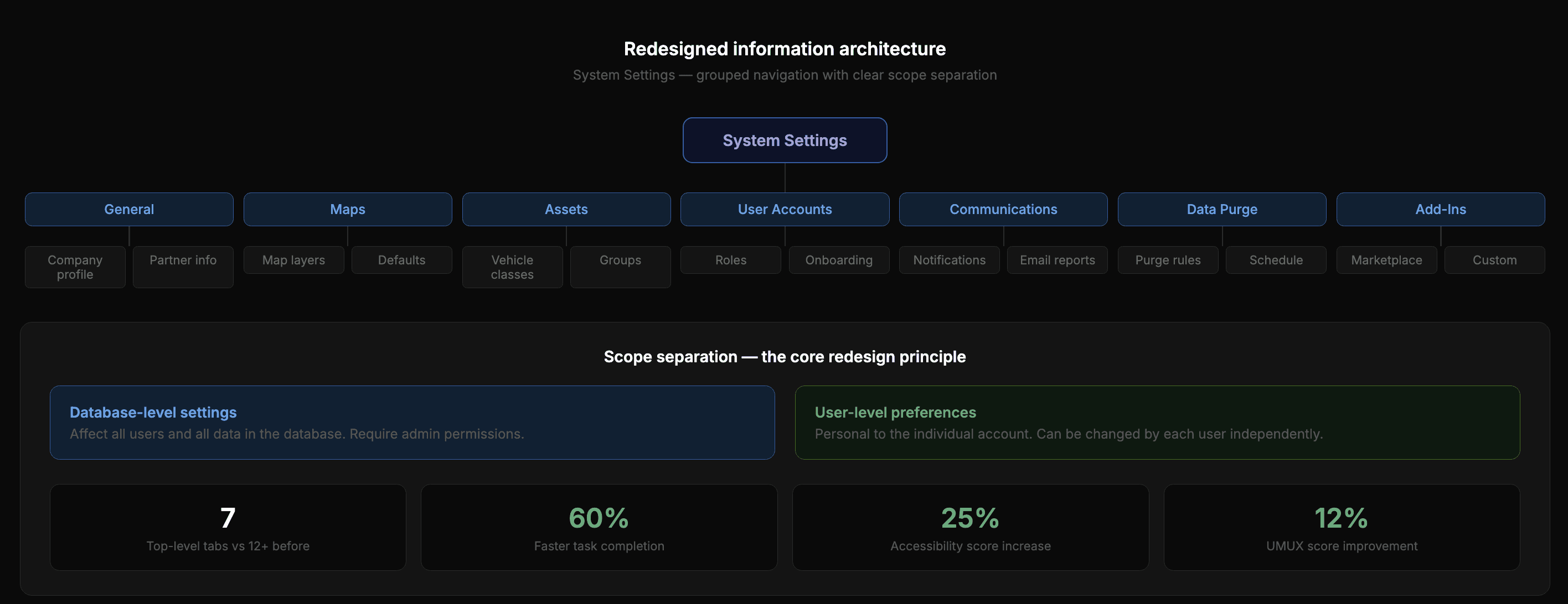
The Card Sort findings directly informed a redesigned System Settings navigation that was implemented in a subsequent release, with clearer separation between database-level and user-level settings. The Manage Charts usability study validated the core feature design and surfaced a critical copy change — from 'Manage Charts' to 'Add Charts' — that improved feature discoverability before code was shipped.